
 Rob Hull
It gives great pleasure to welcome the newest member of the Figures and More family: Benjamin David. Benjamin will be covering Funko for us, and his first article is a review of some of the NYCC Exclusives. Welcome, Benjamin!
DC Funko Exclusives Review- NY Comic Con Batgirl Pop! and Harley Quinn Dorbz
By: Benjamin David
Any good comic con should roll out enough new and exclusive toys for it to feel like Toy Fair, or other major toy conventions. A few weeks ago at NY Comic Con was no exception. DC didn’t hold back either, namely with their NYCC exclusive lineup of Funko figures. This year, I got my hands on a few pieces I’d like to review: Classic Batgirl Pop! and Suicide Squad Harley Quinn with Mallet Dorbz.

In many iterations of Batgirl, the most popular female sidekick of the Bat and Harley Quinn certainly have their moments in battle, and even in working together at times. The characters of Barbara Gordon/Batgirl and Harleen Quinzel/Harley Quinn are just as tough and independent on their own as they are unflinchingly loyal sidekicks to Batman and Joker. This year, DC gave us some pretty good figures at NYCC, paying homage to these two beautiful and powerful ladies of the Bat-universe.
Bat-Ladies First- Pop! Heroes Presents:
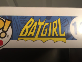
Funko 2016 NY Comic Con Exclusive- Classic Batgirl Pop! Vinyl
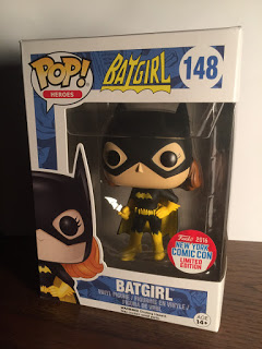
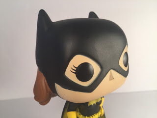
If you’re looking for a Pop! from the modern day Batgirl of Burnside, then keep it moving. Take a crime fighting journey with Barbara Gordon/Batgirl back to the classics, with Funko’s brand new NYCC Exclusive Pop!, Classic Batgirl. In the current DC Comics Batgirl continuity, Batgirl of Burnside as she is known, our hero has a much different, more functional and modernized look, with a completely different color scheme from this NYCC Batgirl Pop! Burnside is primarily purple and yellow. Here, however, we get one of the classic black and yellow looks.
CHARACTER
As the character of Batgirl (or Batman, for that matter), the black and yellow color scheme is in the classic Bat-DNA. Even if this pair of colors fades from Batman/Batgirl comics continuity or other media for awhile, you’ll never be able to fully escape it. So, this Pop! undoubtedly nails the identity of the character, in terms of color choice and character selection. That being said, I have more issues than I’d like to with this Batgirl Pop!. I am a die-hard Bat-fan, therefore I want this Pop! to be perfect more than anyone. Though, unfortunately, my love for the Bat doesn’t change by feelings toward this particular Batgirl.
Again, the choice of black and yellow as a color scheme for a “classic” Batgirl Pop! is both fitting for the character and just a great idea in general. In terms of faithfulness to this classic iteration of the character, even the logo on this figure’s packaging is from her 70s and 80s iterations, Batgirl’s very own logo created by DC just for her.
PAINT
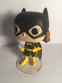
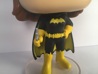
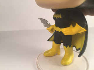
A crucial design element to any Batsuit is the Bat-symbol on the chest. This was one area of the paint application I was pretty impressed by with this Batgirl. The tiny stencil used to emblazon the bright yellow Bat across her chest left no streak mark or signs of the sharply contrasting shades/colors bleeding together. The yellow Bat outline isn’t smudged or dripping into the surrounding black of the suit. I’m impressed with how clean and precise application must have been for this figure’s symbol.
The gloves/gauntlets are also very well painted, and in fact, I think it’s safe to say they are the best painted features of the figure. There are no signs of visible brush strokes, translucency of yellow over black, and no drips, smudges or bleeding of the yellow into the nearby black.
.
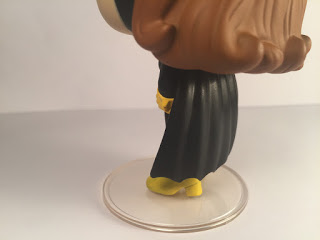
As I mentioned, I did like the idea for the black/yellow color scheme. Though, I wish I could say as much about the application of said colors on numerous other things–beside, of course, the Bat-symbol and gauntlets. To be fair, I do realize these figures rarely cost more than $15.00. At that price point, you need to give some leniency with paint application. However, the problem here lies not with the paint necessarily, but the fact that it’s yellow paint over black vinyl.
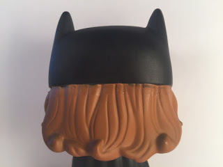
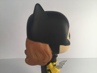
When looking closely at most things with yellow paint on this Batgirl, you’ll very quickly realize the entire figure was cast in black plastic. This means that any lighter shade paint will appear slightly see-through if not applied enough. The paint department overlooked this translucent yellow over black problem in numerous places on the figure– and as much as I loved the shape and clean outline of the aforementioned Bat-symbol, the black is visible there as well. I am not sure what color vinyl the head piece was cast in, but there is some bleeding of the colors between the brown of Batgirl’s hair and the black of her cowl.
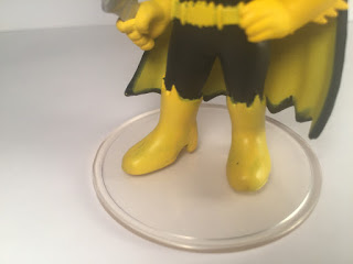
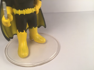
Both yellow boots suffer the same fate from this paint job but far worse than the Bat-symbol. At least the paint on the symbol was not visibly streaked and more translucent in some places and less in others. The boots are full of visible brush mistakes, unsuccessfully trying to cover the black.

But, the part of the suit most affected by far is the inside of her cape. The yellow in this case is the most translucent and doesn’t even reach the edges fully. The cape itself is actually one of my favorite parts of this figure, although specifically in terms of its shape and the sculpting work necessary to make that beautiful shape. But, it’s disappointing to see such a nicely shaped feature of the suit be half covered in this lightly applied paint application.
SCULPTING, ACCESSORIES, AND ARTICULATION
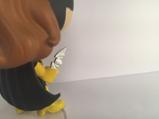
Most of what I like about this figure lies with its sculpture. Specifically, the cape and gauntlets stood out to me, as well as Batgirl’s single accessory, her batarang. As I mentioned, I did have issues with the paint application on the Batgirl’s cape, and I was also not a huge fan of how bright her batarang is painted. Still, all three of these features were my favorite parts of the figure. For such a small accessory, there is a surprising amount of sculpting detail on the batarang. I also loved the stance they chose to sculpt her in. Tough girl in one hand with her batarang and a very confident feminine pose on her hip with her other hand. Both choices for her hands and her pose in general are very appropriate for the character of Batgirl.
While talking about paint, I described my love for the curvature and overall shape of Batgirl’s cape for this Pop! It folds naturally and yet somehow fantastically curves and almost wraps Batgirl’s bottom half. With her left hand on her hip, her elbow pushes the cape up and aside, slightly opening its span in a nicely detailed way.
Batgirl’s gauntlets and gloves have wonderful detail, and again, feature probably the best paint application on the whole figure. Each finger is perfectly visible and wraps snugly around her batarang in one hand and her hip In the other. I also think Batgirl’s utility belt is pretty well sculpted. They perhaps could have made a gadget or two more visible, but that’s a very small critique. For the most part, it’s a good utility belt with a good classic Bat-symbol. A quintessential feature of the Batsuit is the utility belt, so in terms of character, they did a good job prioritizing their sculpting ideas to fit the important features of Barbara Gordon/Batgirl.

Batgirl’s head, cowl, and hair all look great from a sculpting perspective, and the signature over-sized Pop! Bobblehead does not actually bobble. Rather, it turns, making it the one and only point of articulation on the figure. I would have personally chosen red hair if I was designing a classic version of Batgirl, but since there are classic iterations of brunettes as well, I don’t want to judge on pure personal preference.
As with many Pop!s, instead of having the spring loaded bobble feature from a more traditional bobblehead figure, this Batgirl’s one point of articulation is a head that can turn 360 degrees. There only being one POA doesn’t bother me in the slightest, and in fact I think it’s a nice bonus that such a figure would even have it. Being able to turn her head gives you much more of a choice in how she is displayed on your collector’s shelf. Now, she has more angles from which she can show off.
And, on the note of display and showing off: if you’re a collector who is okay taking your figures out of the box for display, this Batgirl figure has a trustee clear circular figure stand to support her more than top-heavy physique.
OVERALL RATING for Classic Batgirl Pop!: 3 out of 5
Harley Quinn with Mallet 2016 NY Comic Con Exclusive Funko Dorbz
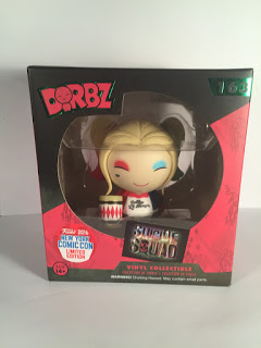
After Suicide Squad especially, the character of Harley Quinn has needed no introduction. The popularity of Joker’s Puddin’ has skyrocketed and only continues to do so–even after how poorly Squad did among critics. In quick response to all the buzz about Harley, Funko and NYCC give us yet another lady knockout from the Bat-universe.
Dorbz and Suicide Squad present the clown princess of crime in the vinyl flesh, Harley Quinn. As a nice change of pace from the Pop! line with NYCC Batgirl, Funko put together an endearing little Dorbz for the Arkham psychiatrist beauty gone villainess.
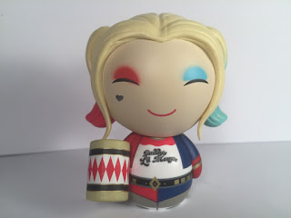
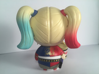
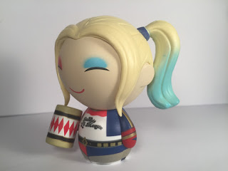
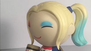
I must say, when I first picked up this figure, I definitely liked it, but I can’t honestly say I loved it. Then, I took it out of the packaging, and my feelings quickly changed. It was striking how clean the paint application was, on her makeup in particular. I feel they nailed the hair as well, which you can tell is cast in an impressive single blond colored piece with her iconic blue/red alternating pigtail tips.
Her mallet accessory perfectly finishes off the cute little artful Harley. This accessory is an important part of who Harley is, harkening back to the character’s origins in the early nineties, on Batman: The Animated Series. Altogether, as I said, I love this Dorbz and I’m pumped she’s now part of my Bat-collection
PAINT
Standing apart from many other well crafted elements of this Harley Quinn is the paint application. Right out of the package, I was very happy with the paint and colors in general. Harley is obviously a colorful character to say the least, so any artist adapting her to a figure is forced to use color. Funko did a fine job with the task, painting her blue and red makeup and pigtails to look just they way they do in Squad.
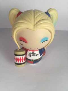
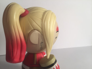
As I mentioned earlier, Harley’s hair appears to be one blonde colored vinyl piece. So, paint comes in specifically for her pigtails and makeup. Her left blue pigtail tie and tip is painted, the same for her right side, but red. Straight from the screen of Suicide Squad, both pigtails are darkest at their tip, fading gradually to blonde about halfway up. The tips are well faded and blended into the blond vinyl and it looks like believable hair dye, as opposed to just paint on a vinyl figure.
I would say hair is the spot where paint is weakest for the figure. Though, even this weakest aspect is a rather minor complaint. If you look slightly closer, you’ll see some small blotches and smudges of blue or red in spots where it’s supposed to be solid blonde. There are also a few tiny spots where the darker blue and red should have been a bit more blended. Other than that, color and paint application for the hair is great on this figure and I’m impressed particularly with the pigtail ties. It seems like a big challenge to paint in and around the surrounding blond vinyl cast without getting Harley’s red .and blue everywhere. Though, not that she’d mind one bit, I’m sure.
Harley’s blue and red eyeshadow is my favorite part of her paint application. It’s a beautiful cross between spray paint and eye makeup. A perfect combination for this iteration of Harley, especially. Suicide Squad Joker was more of a street inspired, crime lord covered in tattoos, and so a graffiti-esque approach to Harley’s makeup works well for this Dorbz. It also looks fantastic over the signature Dorbz eye lines and Harley’s tiny red, perfectly U-shaped line of a smile.I also love the added character details of Harley’s tattoos from the film: her heart tattoo under her right eye and “Rotten” written along the right side of her neck.

As for her body, and for most Dorbz figures in general, Harley appears to have two different pieces of thick vinyl print, lined up together and glued onto the cast of the signature round Dorbz body. The “Daddy’s Lil’ Monster” on the front of her white tee shirt, and “Property of Joker” on the back of her jacket both look crisp,clear, and again, straight from the film. Beyond that, whatever is vinyl or painted, it all looks great and blends seamlessly together. Both the shirt and jacket are on point and totally faithful to the film. This Dorbz even has Harley’s booty shorts. The gold along her belt and other spots is great, but I am missing one gold thing I thought was crucial to the Squad version of Harley. And, that is the Puddin’ choker. I thought that would have been a nice touch, but this too is a small complaint.
SCULPTURE
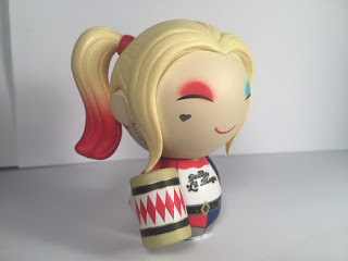
For Dorbz, the head piece is really the place to shine in terms of sculpture. Because most Dorbz’ bodies are shaped the same, hair is where sculptors are doing most of their work. For Harley, the head piece would be the hair, and this head of hair looks amazing. It’s a great sculpting job for such a small figure, let alone at the super low retail price point of $10.00 or less. I am pleasantly surprised at the solid blond vinyl casting work and the simple details Funko was able to add to make it look like Harley’s actual crazy head of blonde hair.
The pigtails are formed in a surprisingly believable proportion to such a strangely proportioned figure. Curves and waves are carved into the blonde for a better representation of hair being pulled back into pigtails.The two large blonde strands on either side of her face impressed me as well.
ACCESSORIES
And now for Harley’s titular accessory: the mallet. Once again, Funko crafted another finely proportioned feature for a figure style already free from constraints of proportion. Add to that, in many iterations of Harley, the mallet is represented out of proportion as it is. So, this accessory for a Dorbz is really a Harley Quinn dream come true. The mallet is also a truly important accessory for this character and for Suicide Squad. The mallet comes from the same place Harley was created, on BTAS. And, in Squad, the mallet only appears as a very short cameo: when she is unpacking her old things upon release from super-prison. Other than that, Harley uses her baseball bat and guns exclusively for the rest of the movie. But, they undoubtedly showed the mallet for an intentional reason. The mallet is who Harley is: tough and violent, while keeping it Looney Tune fun and goofy.
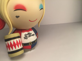
The mallet is also what makes this Harley Dorbz an exclusive figure. The non-exclusive Harley Quinn Dorbz with these same outfits are all featuring her with the bat, not the mallet. As with the rest of the figure, this mallet is straight from the film, including the classic red Harley Quinn diamond pattern. The red really pops against the white background and is finished off with gold and black trim to match her outfit. For a hardcore fan of old-school Harley from BTAS, and someone who also liked her character in Squad, this mallet accessory is a perfect combination for a figure representing the new cinematic version of a favorite classic Bat-character.
There is no articulation on this Harley Dorbz, but I don’t really see a need. Even if you had the one POA of the head turning, the Dorbz design does not lend itself to look nearly as good as a Pop! when its head and body are turned. Different angles and stances wouldn’t really seem work for the more monolithic, straightforward body design of Dorbz. I’m more than OK with no articulation on this here Harley.
OVERALL SCORE: 4.5 out of 5


